Your cart is empty
Looks like you haven't added anything to your cart yet









Why Custom Signage Matters for Branding: 2026 Guide
Table of Contents
- Why Custom Signage Matters for Branding
- Types of Business Signs That Build Brand Identity
- Business Sign Design Best Practices
- Signage for Brand Recognition: How Visibility Drives Foot Traffic
- How to Plan, Budget, and Measure Signage Performance
- Materials, Durability, and Accessibility in Sign Design
- Frequently Asked Questions
Last Updated: October 7, 2026
Why Custom Signage Matters for Branding
Custom signage is the physical face of your brand.
A sign is the first handshake between your business and a customer, telling people who you are and whether you look worth walking into.
Here is what we will cover: the types of signs that build brand identity, design rules that hold up in real conditions, and a simple process for planning, budgeting, and measuring your signage.
Key Takeaway
Custom signage works as branding because it repeats your logo, colors, and message at the exact moment a customer is deciding whether to walk in. Consistency across every sign beats one expensive showpiece.
Types of Business Signs That Build Brand Identity
The right mix of business signs depends on where your customers are and what you need them to do.
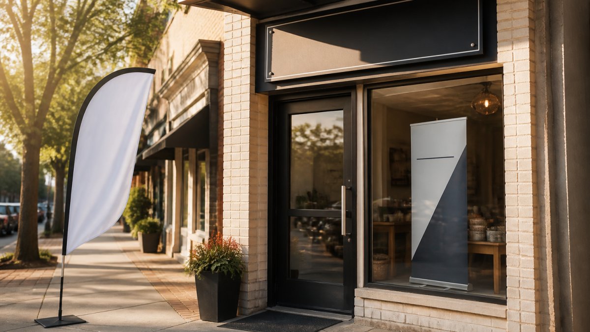
Outdoor Signage: Storefront Signs and Feather Flags
Outdoor signage does the heavy lifting for foot traffic. A storefront sign anchors your location and makes you findable. A feather flag adds motion and height, pulling the eye down a busy street.
Our 14 ft Feather Flag prints on polyester mesh with dye-sublimation, so colors stay saturated, and it stands up to wind speeds of 18-23 mph.
Indoor Signage: Banner Stands and Wayfinding Displays
Indoor signage keeps the brand experience going once people are inside. Banner stands work for lobbies, trade show booths, and registration areas. Wayfinding signs help visitors find the right desk, room, or exit without asking.
The curve top banner stand sets up fast and holds a double-sided stretch fabric print, so it reads from both directions; the steel base and aluminum frame carry a lifetime warranty. For something even quicker to deploy, the Portable Roll Up Banner ships in two business days with a travel bag.


| Sign Type | Best For | Where It Works | Setup |
|---|---|---|---|
| Storefront sign | Permanent brand anchor | Building exterior | Permanent |
| Feather flag | Drawing foot traffic | Sidewalks, event grounds | Minutes |
| Banner stand | Booth and lobby displays | Indoors, trade shows | Minutes |
| Roll up banner | Fast, portable messaging | Events, offices | Minutes |
| Foam core sign | Novelty and photo moments | Events, retail floors | Seconds |
Business Sign Design Best Practices
Good sign design comes down to three things: your logo, your brand colors, and your typography. If those three are consistent, your signs look like they belong to the same brand even when formats differ, but the design also has to survive real viewing conditions, and that is where most signs fail.
Logo, Brand Colors, and Typography
Start with your logo. Place it where the eye lands first, usually the top or center, with enough clear space that it does not compete with other text.
Brand colors should carry the background or the main text, not both at full strength.
Typography needs to work at distance. Stick to one or two fonts: a bold sans-serif for the main message and a simpler font for supporting details.
Readability Math: Sizing Text for Real Viewing Distance
The single most useful rule in sign design is the one-inch-per-ten-feet guideline: for every 10 feet of viewing distance, plan on roughly 1 inch of capital letter height. A sign read from 30 feet needs letters around 3 inches tall; one read from 100 feet needs roughly 10-inch letters. It prevents the most common mistake: text that looks fine on a laptop and vanishes from the sidewalk.
A few adjustments change the math:
- Contrast and color affect perceived legibility. Dark text on a light background reads at a slightly greater distance than the reverse.
- Font weight matters more than font size at the margins. A bold weight holds up at distance where a light weight breaks down.
- Viewing angle shortens effective distance. A sign seen at a sharp angle from a passing car needs larger text than one seen head-on.
- Dwell time changes the requirement. A driver at 35 mph has a fraction of a second; a pedestrian waiting at a crosswalk has several seconds.
Accessibility and Inclusive Design
Accessibility deserves a place in the design conversation from the start, not as a retrofit. The U.S. Access Board guidelines on accessible design set requirements for signs in public accommodations, including character size, contrast, mounting height, and tactile and braille elements for permanent room and space identification. If your signs serve the public, check those standards early.
A few practical rules cover most cases:
- Use high-contrast text against the background
- Keep lettering large enough to read from the expected distance
- Add tactile or braille elements where the rules require them
- Avoid glossy finishes that create glare under direct light
Test Before You Print
- Keep the main message to five words or fewer
- Use high-contrast color pairs
- Match fonts to your existing brand guide
- Leave breathing room around the logo
- Test the design from across the room before you print
Pro Tip
Print a paper proof at full size and tape it to the wall. Step back 20 feet. If you cannot read the main line in two seconds, the sign is too busy. We see more signs fail from too much text than from too little.
Durability and accessibility are not extras. They decide whether your sign still works in year three, and whether every visitor can use it.
Signage for Brand Recognition: How Visibility Drives Foot Traffic
Signage for brand recognition works because repetition builds memory. Every time a customer sees your logo in the same colors and font, the association strengthens, which is why a consistent sign program beats a single expensive sign.
Visibility is not just about size, placement matters more. A sign at eye level near a crosswalk gets seen more often than a larger sign tucked above a doorway, and a feather flag near the curb catches drivers and walkers who would otherwise miss the building entirely.
For government agencies, the same logic applies at events. A branded booth with a banner stand reads as organized and credible, and brand consistency across every touchpoint, from the parking lot to the registration table, tells people they are in the right place.
How to Plan, Budget, and Measure Signage Performance
A practical signage plan starts with the customer's path, not the product catalog. Map where people first see you, where they decide to come in, and where they need directions once inside, then match a sign to each point.
Step 1: Map the Customer Journey
List every point where a customer sees or needs information. For a retail store, that might be the street, parking lot, entrance, aisle, and checkout; for a trade show booth, the aisle approach, booth edge, demo area, and follow-up table.
Step 2: Set One Goal Per Sign
Awareness, direction, or promotion, not all three. A sign trying to do everything does nothing well. A feather flag catches the eye from a distance, a wayfinding sign moves someone to the right place, and a promotional banner announces a specific offer.
Step 3: Pick the Format
Outdoor, indoor, or portable, based on location and weather. Match the format to the environment: mesh for wind, stretch fabric for smooth indoor finishes, rigid substrates for permanent mounting. Format drives the material decision, not the reverse.
Step 4: Draft the Message
Five words or fewer for the main line. Supporting text can carry the details, but the main line has to land in a glance.
Step 5: Check Readability
Test the proof from the real viewing distance. Use the one-inch-per-ten-feet guideline as a starting point, then adjust for contrast, angle, and dwell time.
Step 6: Budget by Lifecycle, Not Sticker Price
The most common budgeting mistake is buying the cheapest option for a permanent location. Divide total cost by expected years of service to get a cost-per-year figure; a sign with a lifetime hardware warranty and a multi-year graphic lifespan usually wins, even when the upfront number is higher.
Cost factors to weigh for any sign:
- Upfront cost of the hardware and the graphic
- Graphic replacement cost and how often the message changes
- Hardware lifespan and warranty terms
- Storage and transport for portable signs
- Installation and removal labor for permanent signs
A simple ROI framework: estimate the additional customer interactions the sign generates per month, multiply by your average value per interaction, and compare that to the annualized cost. You do not need precision, just a defensible order of magnitude.
Step 7: Measure and Adjust
Measurement is where most teams stop short, but you do not need fancy tools. Compare foot traffic, booth visits, or front-desk questions before and after a sign change, and ask new customers how they found you.
Practical measurement methods that work without a marketing budget:
- Before-and-after counts. Tally walk-ins or booth visits for two weeks before a sign change and two weeks after.
- Ask the question. Add "How did you hear about us?" to your intake or checkout script and track the answers.
- Coupon or code tracking. Put a unique code on a promotional sign and count redemptions.
- Brand recall checks. Ask a small sample of customers to describe your sign from memory. If they cannot, the design is not sticking.
- Campaign lift. Compare sales or inquiries during a signage campaign against the same period in a prior month.
Watch Out
The most common budgeting mistake is buying the cheapest option for a permanent location. A low-cost stand that fails in a year costs more than a durable one that lasts a decade. Match the product to how long and how often you will use it, and calculate cost per year before you decide.
Run the plan as a loop, not a one-time project: map, set goals, pick formats, draft, test, budget, measure, adjust. Each cycle makes the next sign program sharper.
Materials, Durability, and Accessibility in Sign Design
Material choice decides how long your sign looks good.
Our BIG HEAD SHAPED FOAMCORE signs are cut to any shape in full color.

Accessibility deserves a place in the design conversation too. The U.S. Access Board guidelines on accessible design cover signage requirements for public spaces, including character size, contrast, and mounting height.
A few practical rules cover most cases:
- Use high-contrast text against the background
- Keep lettering large enough to read from the expected distance
- Add tactile or braille elements where the rules require them
- Avoid glossy finishes that create glare under direct light
- Mount signs at a height that works for seated and standing visitors
Durability and accessibility are not extras. They decide whether your sign still works in year three, and whether every visitor can use it.
Signage is one of the few branding investments that works around the clock.
Frequently Asked Questions
How does custom signage help customers recognize a business?
Custom signage puts your logo, brand colors, and typography in front of people repeatedly. That repetition builds brand recognition, so customers connect your visual identity with your business before they walk in. A storefront sign, a feather flag, or a banner stand at an event all reinforce the same message. The more consistent the design across every touchpoint, the faster people recall your business when they need what you offer.
What should a business include on a custom sign?
A custom sign needs your logo, brand colors, and a clear message. Include your business name in a legible font, a short tagline if it fits, and contact information when the sign serves as a customer touchpoint. For outdoor signs, keep the text minimal so it reads from a distance. For indoor signage like wayfinding, prioritize directional clarity. Every element should match your visual identity so the sign feels like a natural extension of your brand.
What is the difference between branding and signage?
Branding is the full identity of your business: your values, voice, logo, colors, and the feeling customers get when they interact with you. Signage is one physical expression of that branding. A sign communicates who you are and what you offer at a specific location. Custom signage matters because it turns abstract brand identity into something customers can see, touch, and remember. Without signage, your branding stays invisible to anyone passing by.
How do you choose signage that fits your brand?
Start by pulling your brand guidelines: logo files, color codes, and approved fonts. Match sign materials and finishes to your brand personality. A professional services firm might choose a curve top banner stand with a clean fabric print, while a retail shop could use a 14 ft feather flag to draw foot traffic. Then think about placement, readability, and durability. Order a small test print first if you are unsure how colors will look on the final material.
- Choosing a selection results in a full page refresh.
