Your cart is empty
Looks like you haven't added anything to your cart yet








Brand Identity vs Logo Design for Startups: Which First?
Last Updated: November 8, 2026
Quick Summary
A logo is a single recognizable mark, while brand identity design covers the wider system of color, typography, imagery and voice that surrounds it. Most startups should commission a professionally prepared logo first, then add brand identity design once several people or vendors begin ordering materials.
- A logo is one part of the identity; the identity is the full set of visual and verbal cues.
- Logo projects typically deliver vector files, a color specification and a short usage sheet.
- Brand identity design adds templates, a style guide and rules for physical and digital surfaces.
- Move to a fuller identity once three or more people or outside vendors produce materials.
- Confirm vector files and print and screen color values before approving the final logo.
Table of Contents
- What a Logo Is and What Brand Identity Covers
- Brand Identity Design vs Logo Design: Key Differences
- Brand Identity Design vs Logo Design for Startups: Examples
- When a Logo-Only Approach Is Enough for a Startup
- Startup Logo Design Process and Budget Scope
- Startup Brand Identity Guidelines: What to Include
- Choosing Your First Branding Investment and Next Step
- Frequently Asked Questions
What a Logo Is and What Brand Identity Covers
A logo is a single recognizable mark, usually a symbol, a wordmark, or a combination of both. Brand identity is the broader system that surrounds it, including color palette, typography, imagery, graphic elements, and the voice a company uses when it speaks. Put simply, the logo is one part of the identity, and the identity is the full set of visual and verbal cues that tell customers who you are.
For a startup, the distinction matters because the two solve different problems. A logo gives people something to remember and point to. A brand identity gives people a consistent experience across every touchpoint, from a website header to a product box to a trade show backdrop.
Think of the logo as the name tag and the identity as the full wardrobe, posture, and way of speaking that goes with it.
Brand Identity Design vs Logo Design: Key Differences
Logo design is a focused task with a defined output: one mark, plus usage rules for sizes, colors, and backgrounds. Brand identity design is broader. It defines how the logo sits alongside a color system, type hierarchy, photography style, and tone of voice, and it usually produces a set of guidelines rather than a single file.
The practical difference shows up in scope and deliverables. For a framework on keeping whatever you choose consistent across uses, see a practical seven-step framework. A logo project typically delivers vector files, a color specification, and a short usage sheet. An identity project adds templates, a style guide, and rules for how the brand appears on physical and digital surfaces. Teams often underestimate how many items need the same treatment, from apparel to vehicle graphics.
Logo design pros: lower cost, faster turnaround, a clear single deliverable, and easier to apply to small items like pens or lanyards.
Logo design cons: it does not tell anyone how to use color, type, or imagery, so inconsistency creeps in as materials multiply.
Brand identity design pros: it gives every future order a consistent reference point and reduces reprints caused by guesswork.
Brand identity design cons: higher upfront cost and more time before the first product can go out the door.
The table below compares what each option delivers, using the points the article makes about scope and deliverables.
| Option | Main output | Key difference |
|---|---|---|
| Logo design | One mark plus usage rules | Narrow scope, lower cost, faster turnaround |
| Brand identity design | Style guide, templates, rules for surfaces | Broader scope, consistent across touchpoints |
| Logo design | Vector files, color spec, usage sheet | Does not define color, type or imagery use |
| Brand identity design | Color system, type hierarchy, layout templates | Fewer reprints caused by guesswork |
| Logo design | Single-file deliverable | Easy to apply to small items |
| Brand identity design | Higher upfront cost and longer timeline | Pays off once many vendors order materials |
Brand Identity Design vs Logo Design for Startups: Examples
Abstract comparisons get fuzzy fast, so here are three startup scenarios that show where a logo-only approach holds up and where an identity system starts paying for itself. Each example names the stage, the deliverables, and the failure mode that shows up if the wrong choice is made.
Example 1: The validation-stage founder. A solo founder testing a subscription snack concept is selling at two weekend markets and running a small social account. The immediate needs are a recognizable mark for a banner, a profile image, and a simple label. A professionally prepared logo with vector files, a primary color, and a one-page usage sheet covers all three.
Example 2: The pre-launch team preparing for a first trade show. A four-person hardware startup has a working prototype and a booth booked. Now the same brand has to appear on a backwall, a retractable stand, a pitch deck, a product interface, and staff apparel, often ordered by different people.
Example 3: The scaling startup with a growing vendor list. A company that has committed to a sustained presence is now ordering apparel quarterly, refreshing digital ads, and briefing outside designers. A logo alone cannot govern this volume. The identity system becomes an operating document: approved logo lockups, minimum sizes, clear-space rules, imagery direction, and tone-of-voice notes.
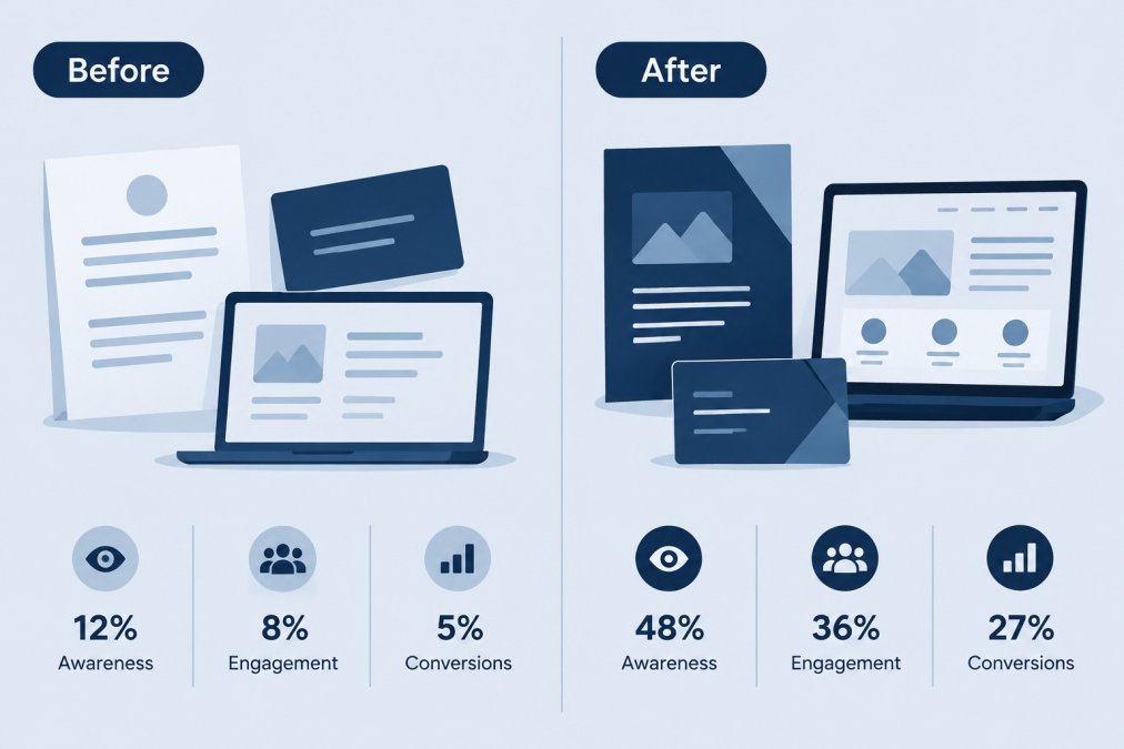
A useful pattern across all three: the trigger for moving from logo to identity is rarely company size. It is the number of people and vendors touching the brand, and the number of surfaces it has to appear on. When one person orders everything, a logo is enough.
When a Logo-Only Approach Is Enough for a Startup
A logo-only approach is sufficient when the business has a narrow, short-term use for its branding. A founder selling at two or three local markets, using the same tent and a single banner, may not need a full identity system yet. The logo handles recognition, and the existing materials stay consistent because only one person is ordering them.
It stops being enough once more people order materials, more channels carry the brand, or the company starts working with outside designers and printers. At that point, the lack of rules creates reprints and mismatched results. Many startups reach this point sooner than expected once they begin ordering apparel for staff and signage for events.
Keep the logo-only route if you are testing a market and expect to change direction within a year. Move to a fuller identity once you commit to a sustained presence.
Startup Logo Design Process and Budget Scope
The startup-specific question is narrower: what should you actually commission now, what should you defer, and what files and rules do you need in hand before you order a single printed item? This section covers the process, the deliverable comparison, the cost drivers, and a phasing approach that avoids overbuying at the validation stage.
The process, stage by stage. A practical logo engagement runs through four stages. First, a short brief that names the audience, the category, and the two or three feelings the brand should convey. Second, concept directions, most designers present two to four. Third, refinement of the chosen direction, including spacing, scale, and small-size legibility. Fourth, final file preparation.
Deliverable comparison. A logo-only project should deliver vector files in the common formats (AI, EPS, SVG, PDF), raster exports (PNG, JPG) at multiple sizes, a primary color specification with print and screen values, and a short usage sheet covering minimum size and clear space.
Cost drivers, not fixed prices. Logo and identity pricing varies widely by market, designer seniority, and scope. You can see how a logo is applied at scale in a step and repeat backdrop design.
Phasing the investment. A sensible startup sequence is to commission a professionally prepared logo with full vector files and a basic color specification first, then add identity elements as the surfaces multiply.
Practical handoff and file usage. Before you approve the work, confirm you receive vector files, because a logo delivered only as a flat image will not scale cleanly onto apparel, signage, or fabric. Confirm the color values are supplied in both print and screen formats, since a screen color and a print color are not interchangeable.
A logo that works on a screen may need adjustment before it is ready for a tent, a banner, or an embroidered item, so test the mark at small sizes and in one color before you sign off.
U.S. Small Business Administration guidance on choosing and working with vendors
Startup Brand Identity Guidelines: What to Include
A useful guideline document for a startup stays short and specific. It should include the approved logo versions with minimum sizes and clear-space rules, the primary and secondary color values in both print and screen formats, the approved typefaces with fallback choices, and a few examples of imagery that fit the brand.
Add a section on how the logo should not be used: no stretching, no recoloring outside the palette, no placement on busy backgrounds. For practical rules on keeping artwork legible on signage, read best practices for designing effective window decals. This is where most reprint problems start. Include a sample layout for each common format a startup actually orders, such as banners, apparel, and wall panels.
Keep a brief tone-of-voice note as well. To see how branding carries across physical surfaces, explore why custom signage matters for branding. Two or three sentences describing how the brand sounds in signage copy and promotional text give anyone writing materials a reference point.
Store the guideline file where every person who orders materials can reach it, and update it when the brand changes. A guide that lives in one designer's inbox does little for the rest of the team. You can set up a logo approval workflow that reduces reprints so orders stay on standard.
Choosing Your First Branding Investment and Next Step
For most startups, the first branding investment should be a logo that is professionally prepared, with vector files and a basic color specification. It covers the widest range of uses at the lowest cost. Move to a fuller brand identity when the business begins ordering materials on a regular basis and needs to keep them consistent.
A simple way to decide is to list the next three things you plan to order. If they all use the logo in the same way, a logo is enough. If they need different colors, layouts, or imagery, invest in identity guidelines first.
When you are ready to order, our team at 2mepromo.com can help you match the logo to products like custom banners, wall panels, and promotional items. Start with the one product you need next and build your guidelines from there.
Frequently Asked Questions
What is the difference between a brand identity and a logo?
A logo is a single mark, usually a symbol, wordmark or combination of both, that identifies a business. A brand identity is the wider system around it: color palette, typography, imagery, layout rules and the voice used in messaging. The logo is one component inside that system. For a startup, the practical difference is scope: a logo answers 'what do we look like,' while a brand identity answers 'how do we look and sound everywhere we show up,' from business cards and banners to product packaging and email signatures.
Should a startup create a logo or a full brand identity first?
Most startups should begin with a logo plus a minimal identity kit: a primary and secondary color palette, two fonts, and a short set of usage rules. That covers the materials a new business uses first, such as invoices, signage, apparel and event displays. A full identity system with imagery guidelines and voice documentation can follow once the business has real customers and a clearer sense of how it presents itself. Build the foundation first, then expand it as the spend and the need justify it.
Can a startup launch with only a logo?
Yes, a startup can launch with only a logo if its early audience is small and its touchpoints are few, such as a single website and a handful of in-person events. The risk appears when the business starts producing branded materials in different styles, since inconsistent colors and fonts weaken recognition. A logo-only launch works best with a simple usage sheet that specifies colors and the minimum clear space around the mark, so every printed item and banner looks like it came from the same company.
What does a startup brand identity include besides a logo?
A startup brand identity typically includes a color palette with exact values, a typography system, a set of approved graphic elements or icons, photography or imagery direction, and brand voice notes covering tone and common phrasing. It may also include templates for signage, apparel, tent and backdrop layouts, and a short guide that tells vendors and staff how to apply each element. Startups can start with the parts they use most and document the rest as the business grows.

- Choosing a selection results in a full page refresh.
